
2020 was the year of data stories. Researchers used them to share critical information about COVID-19. Economists used them to demonstrate changes in the job market. Government officials used them to communicate new voting procedures. The list goes on.
In the insights community, we’re used to turning dense data into compelling visual stories. We’re comfortable interpreting complex information, and for some of us, the complexity is exciting. But when you’re tasked with crafting the appropriate story for an audience, there are a number of critical factors to consider to make sure the stories break through the noise.
This year, we saw a lot of effective and evocative data visualizations. Here are four lessons we learned about using these tools to drive behavioral change.
One of the biggest data stories in 2020 centered on the “flatten the curve” mantra this past spring. During this period, COVID-19 was still new to the US, and government officials were tasked with explaining the nature of the virus, its impact on our healthcare system, and the reasoning behind certain community actions.
New York Governor Andrew Cuomo covered all of the elements and inspired action through his daily coronavirus briefing. His clear and accessible PowerPoint slides became the subject of national conversation, not because they were flashy or exciting, but because they brought clarity to a series of complicated issues. In fact, the simplicity of his slides worked in his favor and helped him reach a diverse group of people. And although Governor Cuomo has his fair share of critics, his message resonated with a wide audience and even earned him an international Emmy. Most importantly, New York did flatten the curve, for a time.

Many insights designers and researchers assume that dynamic, data driven storytelling will automatically drive behavior in an intended direction. It’s easy to think, “When they see what I see, then of course they’ll follow my advice!” But you can’t assume the story you’re telling will resonate equally with everyone. Emotion can distort or even obfuscate the narrative arc of the story, leading to a failure to persuade a segment of your audience.
To overcome this, you should research your audience’s goals and motivations. Are they open to accepting new information? Do they trust you? Consider adjusting your story arc and the imagery to either provide clarity or build emotional resonance. Your goal should be to find common ground and then present accurate, uncompromising information within the context of your most critical audience’s goals and motivation.
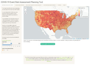
One powerful interactive piece that has made the rounds this autumn is the COVID Risk Assessment Planning Tool. This experience, created by a team of data scientists and health experts, allows Americans to search the probability of running into coronavirus at gatherings by the size of the gathering and by county. The team updates the information regularly to keep up with the most recent COVID-19 data.
Many of this year’s biggest events impacted people differently based on their race, location, socioeconomic status, or other demographic distinction. It has been critical for users to be able to extract relevant information quickly and understand how to apply it in their own lives. The ability to customize and even create relevant micro-stories has helped enhance engagement and ensure that users get the information they need efficiently.
Insights professionals are often tasked with communicating large volumes of information that aren’t equally relevant to all stakeholders. For instance, when you’re delivering insights that address multiple geographic locations, product lines, etc., you can alienate certain members of your audience by relying on a static visual that tells only part of the story. Interactivity helps you accommodate members of your audience who want different levels of information about different parts of your study. Furthermore, research shows that interactive content has a higher success rate in educating an audience than static content.
This year, publications have used animations to explain everything from vaccines to systemic racism. These animations crafted clear narratives that showed cause and effect, demonstrated the passage of time, and explained terms that could be unfamiliar to their audience. These animations made serious topics more approachable, like this music video from Vietnam that explained how the virus spread from Wuhan and the importance of washing your hands. The video inspired a dance challenge and became a global sensation, raising awareness about coronavirus.

In the insights world, we sometimes have to share unfamiliar methods and frameworks or bring misunderstood consumers to life. In these situations, you can’t allow any room for ambiguity in the narrative or flow of your story. A motion graphic or animation can help your audience understand workflows, processes with multiple steps, or systems that rely on unfamiliar or technical jargon. They can help you introduce new research frameworks, explain unfamiliar concepts, and show cause and effect relationships. Depending on the nature of the video, they can also help you build an emotional connection and create a community experience. In fact, research shows that using animation or video can increase retention by 80%.
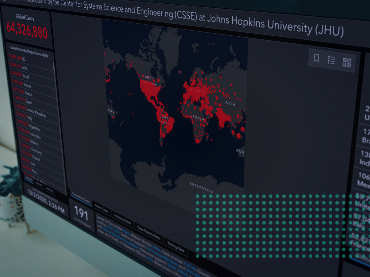
In a year where data-driven storytelling was often the vehicle through which lifesaving and life changing information was consumed, we saw a surge of interest in real-time data visualization. At the end of April, the CDC homepage beat out all of the popular news sites after months or years of minimal traffic. The Johns Hopkins COVID-19 dashboard, which tracked the spread of COVID-19 around the world, was named one of Time Magazine’s 100 Best Inventions of 2020.
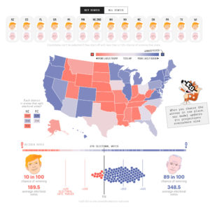
In the second half of the year, election coverage took center stage. The infamous political polling site fivethirtyeight went from an internet traffic and engagement ranking of #1,968 to #62 in just 90 days from August to November 2020. During the week of November 3, when the US election dragged on for the better part of a week, news channels with interactive maps became a primary source of election content. The network news “map guys” like John King and Steve Kornacki, who controlled the interactive maps and did on-air electoral math, saw an increase in their celebrity status. Steve even drove an increase in khaki sales.
Data that updates at a regular cadence or in real time can create an addictive level of engagement, particularly when the stories have material significance to public health or other emotionally salient topics. The power of data visualizations that change over time is that of a shifting narrative that requires repeated engagement to stay in the loop. The result for insights designers and analysts is stickiness and lots of eyeballs.
If you want your stakeholders to stay engaged with your data, keep a high level of interest in your findings, and follow a narrative that stretches over long stretches of time, consider designing an interactive living data story. A real-time data visualization can keep your insights alive, present, and relevant for other members of your team.
Over this past year, we’ve seen data visualizations become an essential part of the way we interpret information. As we head into 2021, we can be sure that data visualizations will remain a powerful storytelling and data sharing tool—one that researchers and communicators can’t afford to ignore.
To learn more about how you can use data-driven storytelling to reach your stakeholders and audiences, contact us.
You must be logged in to post a comment.
